Responsive Travel Websites are Crucial for Success
By David Eddy on Nov 3, 2015 7:00:00 AM

The benefits of a responsive travel website are so compelling there’s no point in even trying to make the case companies in the travel industry can succeed without on e. No doubt some are trying, but they’ve put themselves in roughly the same position as a brick-and-mortar store operating with inconvenient parking and accepting just one type of credit card. Perhaps some succeed in the short term, but those companies suffer an economic loss from missed profits. Since a website with responsive design is one that recognizes a visitor’s device and changes page configurations for best viewing, it stands to reason a nonresponsive site can never achieve the same user experience.
Responsiveness tied to Travel Technology Trends
It’s likely many companies without responsive sites simply allowed travel technology trends to overtake them. Their sites were built before customer usage of tablets and smart phones became significant, and a new investment in a responsive travel website never gained a sense of urgency.
Technology is moving so quickly it’s understandable a large number of travel companies are finding themselves in that position. After all, five years ago far fewer people used their phones for Internet transactions and even three years ago tablets were just gaining traction in the marketplace. Now things are different; as reported in PhoCusWright’s Traveler in 2013, devices were used during the travel lifecycle as follows:
- Destination Selection: Desktop – 82%; Smartphone -35%; Tablet – 22%
- Shopping: Desktop – 82%; Smartphone – 34%; Tablet – 21%
- Booking: Desktop – 57%; Smartphone – 19%; Tablet – 12%
Websites built more than five years ago could easily have overlooked the need for responsive design and any growing instances of abandonment might be missed by current owners or management. While visitor abandonment can be more difficult to measure and counteract, lack of website responsiveness is easily seen. 
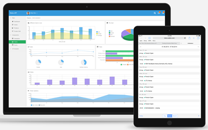
The screen comparison graphic shows how a responsive website alters the configuration of a page for visitors viewing it on desktop, tablet or smartphone. In this case, the page is where visitors can search for flights. The smaller screen sizes of smart phones and tablets triggers the website’s responsive design to eliminate background photos and other nonessential page features and stack the search fields so the visitor can clearly see those fields and easily populate them. Without responsive page design, the visitor would be unable to search for flights and highly motivated to abandon the site.
Any travel company's website can be checked for responsiveness by simply opening it in all three types of devices: desktop/laptop; tablet; smart phone. If pages do not reconfigure in a way resembling this graphic, the website is not responsive.
As with most technologies, there are downsides to responsive design – particularly if you have a nonresponsive website that provides a good user experience. Since websites download all content, switching to responsive design will mean changing an existing website, often in big ways. For example, large images may have to be eliminated if they can’t be resized. Website sliders or image carousels may have to be eliminated if they take too long to download on other devices. Other existing features may have to be redesigned so they can be properly seen and used on smaller screens.
A Summary of Responsive Benefits
Despite these drawback (often accompanied by additional design costs), the advantages of responsive design drive its growing popularity and acceptance. That’s not surprising: many of the advantages go to the heart of the user experience and that’s absolutely central to the website’s success. Other benefits are as follows:
Directly Supports Revenue: travel websites typically contain online booking software, which means – as seen in the screen comparison graphic – search fields plus search results, travel service details and a means for payment. Unless a website is responsive it cannot take a visitor through this transaction cycle and revenue is lost.
Aligns with New Technology: since responsive design conforms to screen size, not device, sites will be compatible with emerging technologies such as: watches, glasses, TV, etc.
High Performance: website loading times are faster with responsive design – higher performance means lower bounce rates.
Cost Effective: travel companies could address the mobile market with a separate mobile website. Since one website costs less than two for both development and support, responsive design delivers a clear advantage.
SEO: going with responsive design rather than a separate mobile site streamlines SEO efforts because visitors are directed to a single site regardless of what device they happen to be using. Also, Google has taken the position that responsive web design is its recommended mobile configuration, and views responsive web design as an industry best practice.
- travel technology (61)
- Travel Industry (49)
- travel agency (31)
- travel erp (31)
- travel trends (28)
- travel booking system (23)
- TINA (21)
- travel company (19)
- Tour Operator (18)
- Product updates (17)
- Travel Management Company (17)
- AIDA (15)
- Business Travel (15)
- TBS (15)
- dcs plus news (14)
- tour operator solution (14)
- travel website (14)
- travel erp system (13)
- Corporate Travel (12)
- Mobile App (12)
- Travel App (12)
- mid back office solution (12)
- trends (12)
- Industry Events (11)
- Mobile Technology (11)
- TMC (11)
- travel agents (11)
- erp (10)
- erp system (10)
- Tour Operators (9)
- Travel booking engines (9)
- dcs plus (9)
- online travel agency (9)
- travel agent (9)
- Business Traveler (8)
- Mobile Bookings (8)
- travel (8)
- travel agencies (8)
- 2017 (7)
- Mobile Travel (7)
- travel business (7)
- travel software (7)
- Digital Technology (6)
- Insider (6)
- Millennials (6)
- Online booking systems (6)
- Travel Management Companies (6)
- process automation (6)
- travel companies (6)
- Big Data (5)
- Partners interviews (5)
- Tour Operator Software (5)
- corporate self booking tool (5)
- customer retention (5)
- travel agency technology (5)
- Booking engines (4)
- CSBT (4)
- Mobile Device (4)
- Mobile travel apps (4)
- OTAs (4)
- Static databases (4)
- Tour Companies (4)
- Travel Policy (4)
- Travel booking systems (4)
- Travel suppliers (4)
- back office automation (4)
- millennial travelers (4)
- online travel (4)
- responsive travel website (4)
- technology (4)
- travel website conversion (4)
- 2016 (3)
- AI in travel (3)
- Content mapping (3)
- Databases (3)
- Demographics (3)
- Food and Adventure Tourism (3)
- Mobile Apps (3)
- Travel Distribution Channels (3)
- Travel Management Software (3)
- Travel customers (3)
- Travel history (3)
- anniversary (3)
- automated processes (3)
- content matching (3)
- global travel industry (3)
- social media (3)
- travel agency workflow (3)
- travel back office (3)
- travel marketing (3)
- travel process automation (3)
- Advanced Booking Systems (2)
- B2B Travel Resellers (2)
- Bleisure (2)
- Branding (2)
- Business Process Automation (2)
- Business Travelers (2)
- Customer engagement (2)
- Financial Reporting (2)
- Food Tourism (2)
- Inbound Marketing (2)
- Infographic (2)
- Leisure Travel (2)
- Saas (2)
- Templates (2)
- Travel Costs (2)
- Travel bookings (2)
- Travel start-up (2)
- Travel website abandonment (2)
- WTM 2016 (2)
- abandoned travel bookings (2)
- engagement marketing (2)
- internet booking engine (2)
- millennial traveler (2)
- new travel company (2)
- office (2)
- online reputation management (2)
- online travel reviews (2)
- reporting (2)
- software (2)
- start-up tips (2)
- travel agency management (2)
- travel agency website (2)
- travel experience (2)
- travel mobile app (2)
- travel packages (2)
- travel reservation system (2)
- travel system (2)
- travelers (2)
- web-based travel erp (2)
- 2020 (1)
- 360 Customer View (1)
- Advanced Accommodation Contract Management (1)
- Adventure travelers (1)
- Apps (1)
- B2B Reseller (1)
- B2B Resellers (1)
- B2C (1)
- BI Reporting (1)
- Budget traveler (1)
- Cancellations (1)
- Chat (1)
- Chinese millennial (1)
- Cloud (1)
- Cognitive computing (1)
- Comparison shopping (1)
- Conference (1)
- Contact matching (1)
- Content (1)
- Cruise (1)
- Culinary traveler (1)
- Customer relations (1)
- Digital Innovation (1)
- Digital Natives (1)
- Documents (1)
- Emerging market travelers (1)
- Emerging markets (1)
- Errors (1)
- Experimental travel (1)
- Financial Dashboard (1)
- Import rates (1)
- Instant messaging (1)
- Integrate with Accounting Software (1)
- Internet (1)
- Luxury traveler (1)
- Mobile Transaction (1)
- Mobile payments (1)
- NDC distribution (1)
- Operational Reporting (1)
- Reseller networks (1)
- Resellers (1)
- Response (1)
- Subagents Network (1)
- TINA Academy (1)
- TTE (1)
- Travel Reseller Network (1)
- Travel Revenue Management (1)
- Travel booking problems (1)
- Travel finance reporting (1)
- Travel stats (1)
- WTM (1)
- abandonment (1)
- accomodations (1)
- advanced reporting (1)
- airline direct connect technology (1)
- ancillary services (1)
- cloud computing (1)
- collection (1)
- collection challenges (1)
- common data model (1)
- conversion rates (1)
- corporate mobile app (1)
- cost control (1)
- credo ventures capital invests in dcs plus (1)
- customer reviews (1)
- data analysis (1)
- dcs plus credo investment (1)
- dcs plus credo ventures (1)
- deloitte technology fast 500 EMEA (1)
- digital transformation (1)
- e-invoicing KSA (1)
- email marketing (1)
- email marketing for OTAs (1)
- erp e-invoicing (1)
- lost travel bookings (1)
- modern travel agencies (1)
- networks (1)
- new features (1)
- offers (1)
- online customer review (1)
- online reputation (1)
- online travel agencies (1)
- risk management (1)
- sales (1)
- senior travelers (1)
- shopping baskets (1)
- shopping carts (1)
- social network (1)
- standardized processes (1)
- static content (1)
- travel SaaS (1)
- travel account services (1)
- travel agency customers (1)
- travel agency profitability (1)
- travel analytics (1)
- travel blog (1)
- travel planning (1)
- travel reviews (1)
- travel shopping carts (1)
- travel software for agencies (1)
- travel software system (1)
- travel technology europe (1)
- travlist smart mobile app (1)
- trend (1)
- trusted adviser (1)
- trusted advisor (1)
- upsell functionality (1)
- vouchers (1)
- website traffic (1)
- zatca (1)
Subscribe by email
You May Also Like
These Related Stories

7 Ways a Travel Company can Capture More Millennial Travelers

Is your Travel ERP System Designed to Support Growth?

No Comments Yet
Let us know what you think